Product merchandising is a group of activities used to promote and sell products in your store.
These activities range from visual merchandising and product display to special offers and pricing. The ultimate goal of product merchandising is to get customers to come into your store and make a purchase, but also to have an enjoyable experience and visit your store again.
Successful product merchandising allows you to get the right products in front of the right customers. By doing this, you’ll order and sell the correct amount of inventory, drive profits, and make your products (and your store) memorable.
Table of Contents
What is product merchandising?
Product merchandising is the practice of intentional promotion, displaying, and selling of the products in your store.
A big part of this isvisual merchandising—the process of creating aplanogram, designing, and displaying products to highlight their features and benefits. The colors, lighting, product positioning, and store layout all play an important role in product promotion.
Product merchandising also includes experiential elements, like getting your store visitors to interact with products, try sample products, take photos, or sit down to take a break.
Promotions andproduct bundlingare also part of product merchandising efforts—as isemail marketing, social media, and any otherdigital marketing strategiesyou use.
Why retailers use product merchandising
1. Brand building and recognition
When customers visit your store or look at your products online, they interact with shapes, colors, the order of products, and many other visuals. For brick-and-mortar shoppers, there are also scents, sounds, and tactile senses at play.
They all play a role at how your customers will perceive and remember your brand. Your brand’s perception is often a result of more than people can grasp on a conscious level. It’s subtle and powerful.
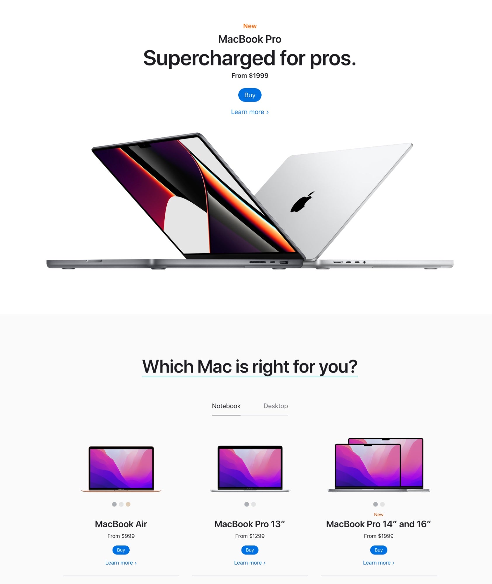
For example, Apple is well known for its simple, minimalist store design with lots of white space. This creates a sense of luxury and focus.

This bright, sleek look and feel translates to itsonline store as well, which features very few colors, short lines of copy, and plenty of space between different elements.
Another example is Lush, a fresh handmade cosmetics brand. If you’ve ever been to a Lush store, you can likely vividly remember what it smelled like. You can also walk through a mall and smell a Lush store nearby, even if you don’t see one.
And once you’re in, you can see hundreds of packaging-free products you can touch, smell, and try a sample of. Lush is famous for its colorful, fragrant in-store experience.

2. Increased sales
Product merchandising emphasizes the best features and benefits of your products and leads to more sales, as well as larger purchases through upselling and cross-selling.
For example, you promote a new hair care line by giving out travel-size samples. The customer doesn’t need a new hair conditioner now, but tries it out once their current bottle runs out. They like it and choose to purchase it the next time they’re in the store.
This is how they discover hair stylers and tools they were looking for, so they buy them and grab samples of other products from the line—and the cycle continues.
Product promotion through samples, positioning, and grouping complementary products encouraged the customer not just to make a larger purchase, but to keep returning to the store as well.
3. Excellent customer experience
The best thing you can do for your customers is to get them to feel good from the moment they enter your store until they leave (and beyond).
Their experience will depend on more than just product merchandising, including interactions with sales associates andpayment optionsthey can choose from.
But your products play an essential role. Was the customer able to find what they were looking for? Could they easily make sure they’re buying the right product for their needs? Did the store layout and signage make it easy to navigate options? Would they tell a friend to visit your store to buy that product?
Product merchandising aims to meet the customer with the best product at the right time. In turn, you’ll create loyal, returning customers and brand ambassadors.
4. Improved inventory turnover
Holding excess inventory is expensive. Holding the right amount of the products your customers want, however, improves cash flow, maximizes your storage space, and avoids unsellable inventory (products you can no longer sell because they’re out of season or style).
This is why product merchandising is key. Instead of passively holding stock and hoping customers find their way to it, you can consider different seasons, customer needs, historicproduct demand, and upcoming trends to intentionallymanage your inventoryand promote the right products at the right time.
Your inventory impacts sales (by dictating how much you can sell) and expenses (by dictating what you have to buy), so it’s worth focusing on product merchandising for maximum sales and cash flow—and minimal risk.
Manage inventory from one back office
Shopify POS comes with tools to help you manage warehouse and store inventory in one place. Forecast demand, set low stock alerts, create purchase orders, know which items are selling or sitting on shelves, count inventory, and more.
Product merchandising tips
Consider customers first
你的产品需要和你说话customers, from your product range to how you name, describe, position, and promote each of your items.
This isn’t just about a customer’s need for a product but also their shopping style and how they make decisions.
For example, people go to IKEA to buy furniture and home accessories, but customers’ needs aren’t that simple. If they were, IKEA would be nothing more than a basic showroom displaying popular pieces of furniture with a checkout at the end.
Instead, IKEA gives its customers the chance to plan and visualize layouts using their products. They can walk through sample bedrooms, kitchens, living rooms, hallways, and patios to get inspired to implement a solution into their own home.

IKEA takes this to the next level with fully equipped and decorated apartment examples, often emphasizing its spaciousness and organization despite a small square footage.

Consider what your customers need and want as they walk into your store.
How likely are they to have the exact product in mind? What information and visual cues do they need to make the best decision? How can you emphasize key details and benefits of products in your store with those needs in mind?
Optimize store layout
Your store layout plays another key role. To improve your store layout, consider your products, the consumer behavior you want to encourage, and your store’s square footage.
Some store layout options include:
- Grid: a pattern of long isles, typically seen in grocery stores and pharmacies, with staple items at the back
- Loop: a predefined path a customer walks through, as seen in IKEA
- Free flow: no defined pattern, great for small spaces and stores with less merchandise
- Boutique: common type of a free-flow layout that groups products by brand, category, or complementary items
Check out all10 store layout optionsto create one that helps you achieve your product merchandising goals. Do you want customers to slow down and browse? See complementary products together? Consider more versions of the same product?
This effort will lead the right customers to the best products for their needs, and in a way they prefer.
Leverage a variety of display types
Product displays can help you draw customer’s attention to specific products and emphasize relevant features of a product.
例如,您可以显示服装人体模型s, garment racks, and display tables. Smaller accessories like bags, jewelry, and fragrances look great on freestanding displays, display cases, and glorifiers.

The idea is to create an engaging, visually pleasing combination of product display types to get customers into the right mood and frame of mind as they browse your store.
Pay attention to how your customers move through the store and interact with different products, and the way they’re displayed, so you can understand what works and what doesn’t. You can tweak product displays and experiment with any of the19 popular retail product displaysfor maximum results.
11 product display and visual merchandising ideas
1. Turn your products into art
Have you ever stepped into a store where the products were also the artwork? It’s quirky and memorable. And while it may not always be functional, it can be a new way to position your products and emphasize what makes them special.
I love when there are artful displays of products, because it shows true mastery of the principles of design. It’s almost conceptual art, or conceptual retail.
The striking art of the nose makes passersby stop and take a closer look—and discover the perfumes beneath the nose. It’s art and product in one, a great balance between tasteful and effective in attracting customers.
“In [retailers’] ability to create an artful piece, they’re also showcasing that this is an important piece for the customer to have. It’s an artful version of a spotlight and I love it,” adds Guillot.
2. Create a full body experience
One of the most unexpected store and product layouts might be Victor Churchil, a retail butcher shop on High Street in Melbourne, Australia.

Every aspect of the interior, an exclusive selection of products, and an elegant service make this a unique, attention-grabbing butcher shop. Its dramatic lighting, dark hues, curves, and marble floors are more reminiscent of a high-end fashion brand.
“We also love that the Melbourne store is a full-body experience. Not a single screen in sight. Instead, the guests are inhaling the scents, admiring the displays, watching the demonstrations, tasting the samples, chatting with each other and with the team members. They are participating, engaging, and enjoying,” states a report byThe Cool Hunter.
Whatever products you sell, you can create an immersive experience that draws store visitors into your world.
3. Take advantage of technology
There are many possibilities when it comes to technology—you just have to find the right way that works for you.
Big tech retailers like Apple and Verizon do this because technology is at the core of their products. But it can work for other industries, too.
Eslite Bookstore uses digital screens to help find where a specific book is located in the store and view video promotions.

And Harvey Nichols, a British department store, uses large-scale touchscreens to show customers videos of collaborations and product information. Customers can also add products to a basket for checkout.

4. Use flower power
There’s scientific proof behind the benefits of fresh flowers—they’ve been found tomake people feel comfortable, relaxed, and natural. And what retailer wouldn’t want an easy-going, happy customer in their store?
Macy’s caught on to this more than 70 years ago with its annualMacy’s Flower Show. It’s a two week exhibition that attracts around half a million people to participating stores.

There’s a reason we give flowers as gifts to the special people in our lives. Most retailers don’t offer such a large, artful display because it isn’t feasible for the space and budget they have, but that doesn’t mean you can’t add flowers to your store.
Place fresh flowers outside your storefront to greet customers, and sprinkle them throughout your store and near the cash registers. Look for ways to thoughtfully integrate them with your product—maybe you use a pitcher as a vase, or you could create fresh flower headpieces for your mannequins.

5. Create upcycled product displays
You can opt for a less traditional way than stands, racks, and display cases to put your products on show.

The Trina Turk Boutique did that with old logs. Instead of displaying her fashion apparel and accessories on standard product stands, it took a rustic, creative approach with trees.
It adds a different visual appeal and speaks to yourbrand identitywhen you use outside-the-box product displays. And if you upcycle in a smart way, it can also save you some serious room in your budget.

Logs aren’t the only way to be creative. Find something that suits your store: refurbished record players could be used in a music shop, wind chimes or necklaces could be displayed on a vintage coat rack, or a wheelbarrow could hold flower seeds at a home and garden shop.
6. Use real humans in lieu of mannequins
Using real humans in your store in place of mannequins can be a powerful visual merchandising tactic—especially if you’re an apparel and accessory retailer.

Abercrombie & Fitch has mastered this. As its target market of teenagers walk past the storefront, they’re attracted to this real-life manifestation of what they aspire to be.
“I am a huge advocate for this notion … being this living embodiment of wearing the apparel,” Guillot says. “That personalized experience, whether it’s visual or not, is so critical. But I love it when it’s visual because then you are weaving seamlessly in it around the space.”
This is extremely effective for these stores because of the lifestyle they sell and their strong brand image, and the models are tangible proof that the Abercrombie & Fitch image is attainable.
Customers will want to buy the clothes those models are wearing so they can live this lifestyle, too—not to mention the photos with the models they’ll share all over social media.
And if your store is starkly different from Abercrombie & Fitch, you can still find ways to use real people instead of mannequins to merchandise your products. Make your products part of the employee uniform, host a fashion show, orhost demoswhere your employees show how they use your products in real life.
7. Guide your customers through your store
If ever a retailer mastered how to direct customers through the store, it’s IKEA. It has laid out its brick-and-mortar locations so well it practically guides every step its customers take.

This works so well, because when you know how your customers are traveling through the space, you also know where they’re likely to look and what they’re likely to see. Using that knowledge, IKEA can place promos, new products, and other priorities in those high-trafficked, visible spots.
Essentially, IKEA can dictate where its customers spend the most time. And that’s valuable for guiding consumer behaviors.
Guillot recommends always considering customer line of sight when setting or refreshing the floor plan. “Customers scan and view the store at about 45 degrees from their own path of walking. So, oftentimes when merchants or owners, or even employees, are setting or fixing the visual merchandising display, they’re doing it right in front, head on, without respecting how customers are walking around,” she adds.
Guillot has advice for breaking out of that habit:
“After you merchandise, or when you’re merchandising, actually physically walk around your space and scan the customer’s line of sight to make sure they’re seeing and approaching the product from this 45-degree angle.”
8. Use your customers
A while ago, Guillot hosted an event atThe Carrot Flower Company, a local floral shop. “The owner had the windows open, a bench outside, and we were using that—not only the inside, but the whole front of the store, too.”

Pedestrians walking by see that there’s a group of people at this store—social proof that this is a place worth checking out. And though no products were part of this display, it’s visual merchandising for your brand and the experience you provide.
Welcome your customers to spend time in your store, even if they’re not shopping. Provide a cozy space for customers to hang out. Things like offering free water, tea, and coffee can go a long way.
9.创建interactivity
The word “interactive” has a technology feel, but you can use interactive visual merchandising without the tech.
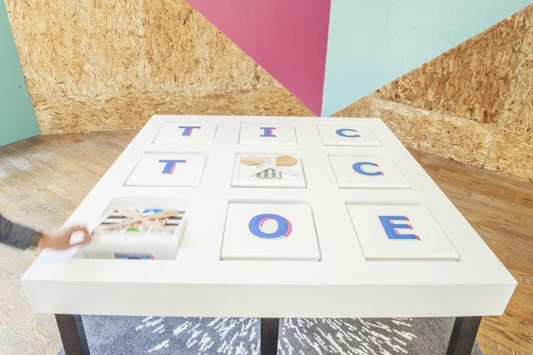
IKEA Canada hosted the IKEA Play Café, a pop-up shop, in Toronto. The homeware store turned a space in downtown into an area where guests could eat, play, and shop.
While almost everything in the shop was interactive, one of the low-tech but popular games was a tic-tac-toe table created with dinnerware.
BlueCollar Working Dog, a dog store in Los Angeles, sells natural foods, hiking packs, locally produced meats, supplements, harnesses, and training equipment. Thanks to a large retail space, these products are arranged around stations for jumping and climbing so dogs can play while their owners shop for them.

10. Challenge the store concept to serve your customers better
LIVELY, a lingerie brand, perceives its spaces to be more than just a place to purchase products. You’ll see customers chatting, having coffee, and taking pictures in front of stunning walls.

Retail used to be aboutsales per square foot. Today, [shoppers] don’t need to come to a store to buy. They want to come to a store for human interactions. They need something to do that’s not on their screen anymore.
Women walking around the city need a place to stop and take a break, and they know they can rely on LIVELY’s store for that. Some have even come in and nursed their babies.

“It’s like a clubhouse. We want women to come in and feel comfortable. They can rely on us to come in here and not feel any pressure to shop,” Michelleadded.
找出方法您可以创建舒适的customers during their visit without pushing them to buy. Grocery stores can provide customers with a free in-store snack, while baby stores can offer free use of a baby carrier for new moms.
11. Repurpose
The famous Pearl Street in Boulder, Colorado, is a top tourist shopping and dining destination. The pedestrian mall spans a few blocks and is lined with quaint shops, restaurants, and drinking holes.
Just a block off the main mall is Salon Liquid, along with its vintage bicycles adorned with flower pots. You might wonder what bicycles have to do with hair, and the connections really are limited. The impact it makes, though, is standing out from the crowd.

“Walking up and down boutique streets, I see really typical signage, like A-frame signs, blade signs, signage painted on windows and awnings,” Guillot says. “People think that’s the fastest way to attract customers.”
沟标准折叠黑板和年代omething more unique for your storefront.Signage inspirationcan be found almost anywhere—check out Craigslist, yard sales, and second-hand shops to see what gems you can uncover.
Examples of retail store displays
Looking for examples of retail store displays to get inspired for your own?
1. Forage Plants
Check outForage Plants, an interior plant shop and community for plant lovers. Its stores carry a sense of home, with comfy chairs, clothes racks, couches, and a bathtub—a great way to make the store feel like a room in customers’ homes, and to help them imagine what a plant will look like in a home setting.
2. Kowtow
Another strong example is Kowtow, a sustainable seed-to-garment retailer. Kowtow sells clothing made from 100% fairtrade certified organic cotton.
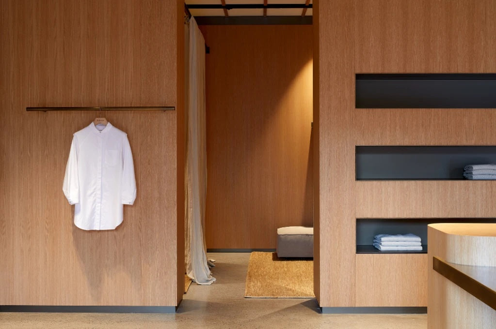
Kowtow storesare dramatically different from what you’d expect of a clothing retailer. Instead of racks and shelves packed to the brim, you can see bare walls, small stacks of garments, and pieces of clothing hanging on their own or only a few at a time.
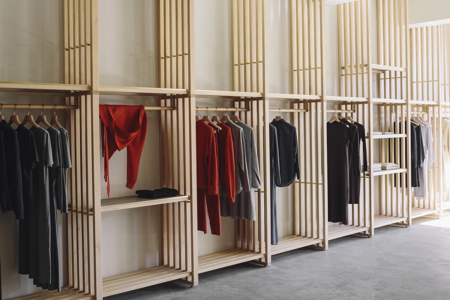
This minimalistic store design is something you’d see in an Apple store, but this clothing retailer gives it a different meaning. The store display perfectly aligns with Kowtow’ssustainability mission, encouraging customers to make conscious buying decisions that preserve the planet.
3. Tokyobike
Finally, there’s Tokyobike, a Japanese bicycle company that came to the United States in 2014.
If you’ve ever been to big stores with sports and cycling gear, you know stores often crowd dozens of bicycles together and display other cycling equipment on tall shelves. It’s not particularly appealing from a visual perspective.
Tokyobiketakes a different, more stylish approach.
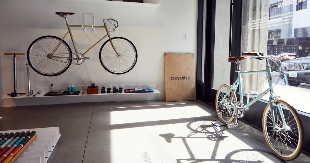
“The intention of the Tokyobike store design was to complement the clean lines and color palette of our bicycle line,” Juliana Rudell DiSimone, co-owner and director of Tokyobike, toldMomentum Mag. “There is a strong emphasis on curation, as our ordering includes a range of products, from bicycles and related accessories to branded collaborations to design goods from Japan and beyond.”

The brand created a concept it calls “Tokyo Slow,” a belief that a bicycle is a vehicle for exploration of one’s city, not just a simple means of commuting. Its store display reflects that concept.
Use these creative display ideas in your retail store
Take these benefits, tips, concepts, and examples and create your product merchandising approach. This way, you’ll be able to emphasize the impact your products can make in your customers’ lives—and generate positive cash flow and loyal customers as a result.
这篇文章是由亚历山德拉细胞系han and has been updated by Marijana Kay.
Make merchandising decisions with confidence
Use Shopify’s analytics and reporting to make the right merchandising decisions at each of your store locations. Spot seasonal trends, see which products need more promotion, measure your promotions’ impact on product sales, and more.
Product Merchandising FAQ
What is merchandising of product?
What are the 4 types of merchandising?
- Product
- Price
- Place
- Promotion

