

Welcome toBehind the Logo, a series that unpacks the history and design decisions behind some of the world’s most recognized logos. After you learn a thing or two, use Shopify'sfree logo makerto create something iconic of your own.
Instagram*, an app originally made to share heavily filtered photos with your inner circle, is today a bona fide tech behemoth, letting you post pictures and videos, find out what your favorite celebrities are up to, and even shop for products from millions of brands.
As Instagram’s mission has evolved since its founding in 2010, so has its user interface and iconic logo. Let’s take a look at the history behind the Instagram logo, its meaning, and the changes it underwent to remain relevant through the years.
The history of the Instagram logo
Instagram was founded in 2010 in San Francisco by Kevin Systrom and Mike Krieger, who came up with the name as a portmanteau of “instant” and “telegram.” Their idea was simple: a platform that would allow iOS users to share square photos of 640 pixels—the display width of the iPhone at the time—as well as “like” and comment on other users’ content.
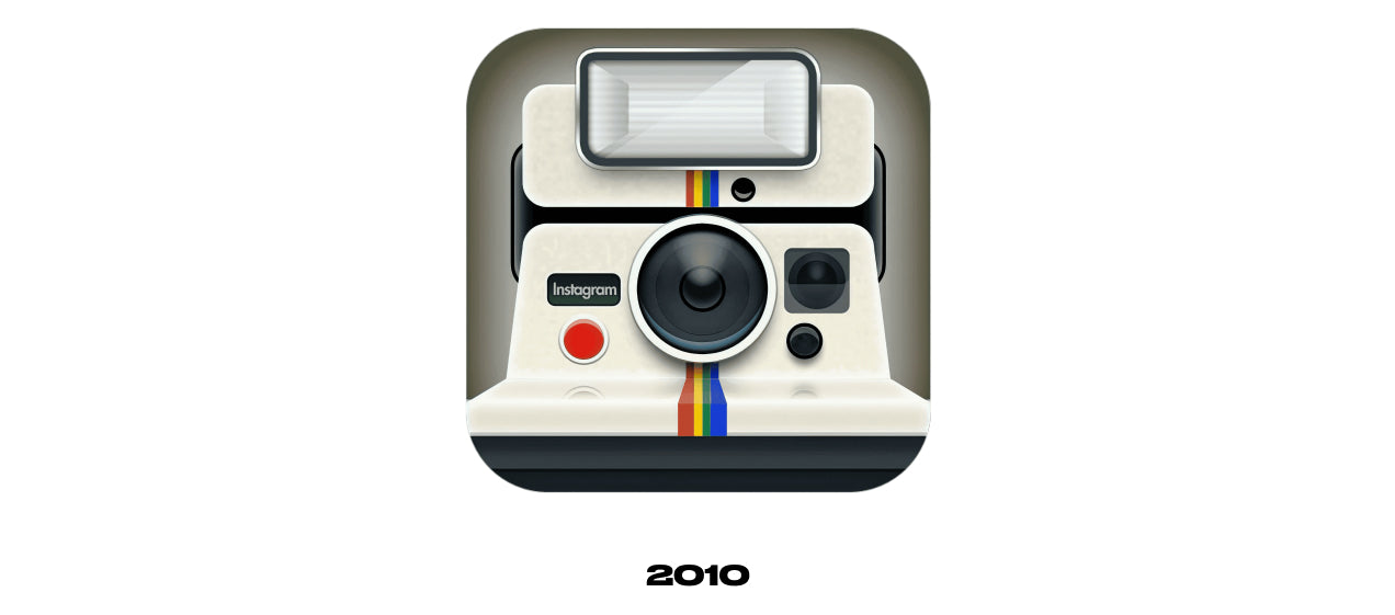
The first iteration of the Instagram logo was simply an image of a Polaroid OneStep camera. It worked as a concept, but Systrom realized that as the brand grew, it would need a new, more creative and distinctive logo that wasn’t dependent on the Polaroid design. So a few weeks later, the team at Instagram commissioned Cole Rise—a professional photographer and designer, as well as a friend of the founders and an early beta tester of Instagram—to simplify their idea. Less than an hour after the call, Rise delivered what would become Instagram’s first widely known logo.
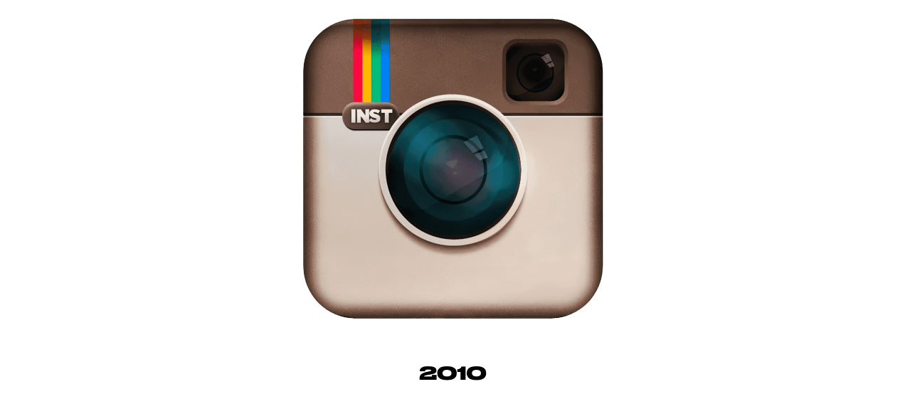
Instagram gained popularity once it was featured on the Apple App Store’s home page. Over the next six months, Rise worked together with the start-up’s small team to refine the logo he had quickly drawn up. He sharpened the textures and shadows, added more details to both lenses, erased the red button, and modified the letters to “Insta.”

In April of 2012, Facebook (now known as Meta) acquired Instagram for what was then considered a mind-blowingsum of around $1 billion. At the time, Instagram had just 13 employees, 30 million users, and still no revenue. It had only been released on Android one week prior to the acquisition.
What was undeniable was Instagram’s potential. While Facebook dominated the desktop social media experience, it was lagging when it came to mobile. Smartphones were becoming more and more sophisticated—their internet connections were improving, and their built-in lenses had begun to rival those of digital cameras. People weren’t using social media primarily on their computers anymore. More and more, they were using apps like Instagram from the comfort of their phones.
CEO Mark Zuckerberg had big ambitions for Instagram, but first he sat back and allowed the app to flourish organically. Through the next four years, Instagram remained more or less the same, with photo-sharing as its primary intention and the already iconic logo of a brown camera with a rainbow stripe left untouched.
This branding made sense for Instagram at the time. It wasn’t long, though, before the grainy, dreamy filters that Instagram popularized, along with its retro-inspired logo, felt dated. By 2016, the rise of Vine and Snapchat indicated a massive interest in videos and fleeting content. It was time for Instagram to start rolling out new features, like Instagram Stories. The design team decided the branding was also due for a substantial makeover.
“Brands, logos and products develop deep connections and associations with people,” Ian Spalter, Instagram’s Head of Design,wrote on Medium in 2016, “so you don’t just want to change them for the sake of novelty. But the Instagram icon and design was beginning to feel, well … not reflective of the community, and we thought we could make it better.”
Along with Eric Goud, Joy-Vincent Niemantsverdriet, and Robert Padbury—the team behind the Instagram logo redesign—Spalter reviewed the icon that had represented the app for so long. “The logo was a very round shape, with these candy-like features in the lens, the color almost brown like a teddy bear, and on top of the teddy bear, a rainbow,” Spalter said in the Netflix docuseriesAbstract: The Art of Design. “How do you go beyond that? What’s important about this? What is actually essential?”
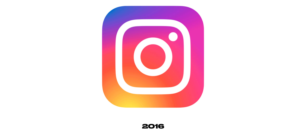
The answers to these questions can be seen in the current Instagram logo design. The redesign team distilled the idea of a camera, using only three shapes to represent it: a rounded square, a large circle in the center, and a smaller circle in the top-left corner. Knowing that the rainbow was a treasured part of the original logo, they used a gradient background with orange, purple, and pink.
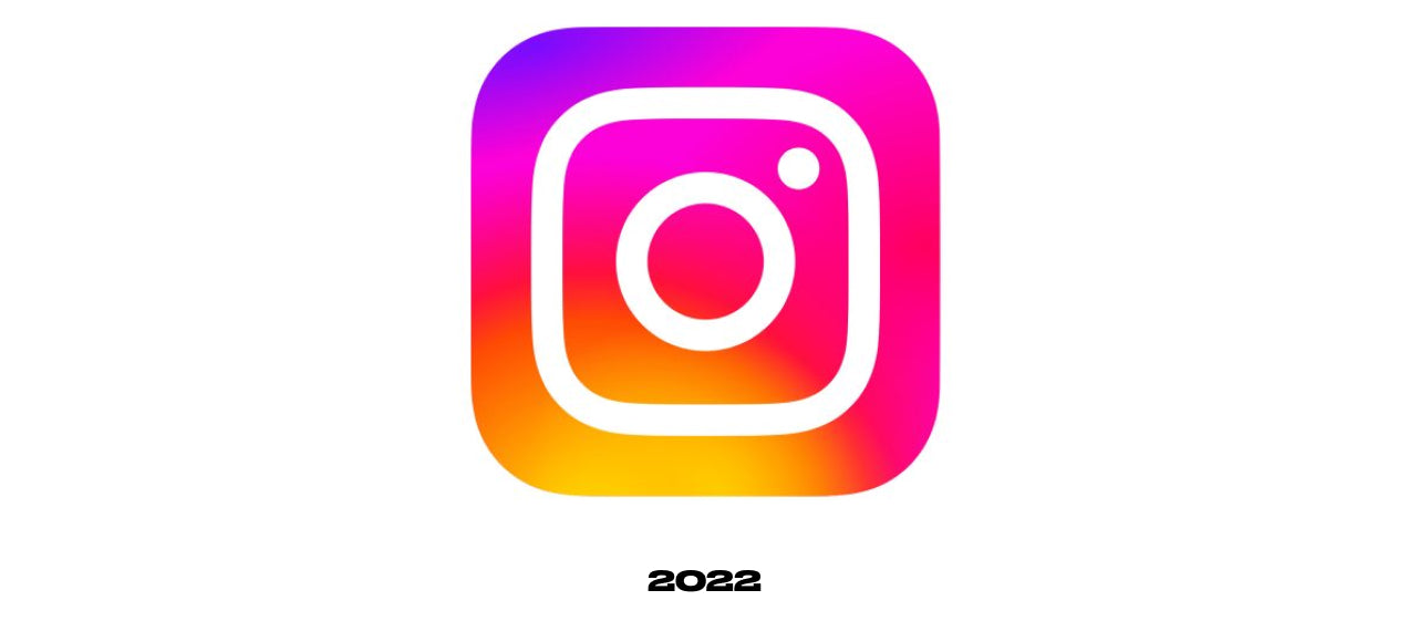
In May 2022, Instagram rolled out a visual refresh of its logo. "Today, we're bringing new energy and purpose to our colors, typeface, logo and other brand elements,"the company announced on its website. "The gradient is reimagined with vibrant colors to make it feel illuminated and alive, and to signal moments of discovery." The updated gradient appears throughout the app, providing visual unity as well as subtle variance; it uses a digital light to create a different gradient effect depending on where it appears. “The concept is that the gradient feels like it’s made of light,”said 3D digital artist and motion designer Rose Pilkington, who worked with Instagram to create the new look. “And it has a kind of a sense of depth to it.”
Examining the meaning behind the Instagram logo
最初的Instagram的标志是fr截然不同om today’s, but the updated version has nonetheless stayed true to the initial concept and brand elements. When Instagram was founded in 2010, the world was recovering from a harsh recession, and Instagram’s founders sensed that people yearned for simpler times. So the original Instagram logo, designed by Systrom himself, was an image of a beige Polaroid OneStep instant camera with a rainbow stripe down the center.
The second logo, designed by Cole Rise, was inspired by a Bell & Howell camera and based on a logo Rise had previously made for his own app. The beige-and-brown design featured a lens, a viewfinder, a red button, and the rainbow stripe from Systrom’s initial logo, as well as the letters “INST” on the left side. At the time, it was a perfect reflection of what Instagram was: a photo-sharing app with built-in filters that gave images the analog look of decades past. It was openly nostalgic, and that was part of what drove its initial success.
2016年Instagram的怀旧过滤器了ut of fashion with the Instagram community, and the logo was in need of a refresh. The next redesign solved this problem, updating the logo to a sleek minimalist rendition of a camera with an eye-catching color scheme. A dramatic departure from the warm browns and throwback aesthetic of the original logo, it nonetheless maintained the essence of the Instagram brand while carrying it over into a new era.
Why the Instagram logo works
A tech company is always looking to the future, and its brand identity should reflect that ethos and evolve with time. Once Instagram matured beyond nostalgic filters and simple photo-sharing, its visual identity needed to reflect the diverse and dynamic digital community it had become. The stripped down, eye-catching logo update achieves just that, while still retaining the core elements of the original logo.
Cole Rise, the designer behind the first widely known Instagram logo, agrees. “I’m super psyched on the new one,”he told Mashable in 2016. “I love the minimalism. Regardless of the colors behind it, the white shape—the actual bones of the new symbol itself—is beautiful, and I think that can persist over time.” The current Instagram logo still resembles a camera and thus captures the essence of the brand, and its simplicity makes it visually striking and memorable.
Design your own logo
Strong branding is critical in the early stages of a business like Instagram—it determines how people perceive your company and product. With this in mind, check outour free logo maker for technology companies, and don’t be afraid to make bold changes to your logo as your brand expands and evolves. A good logo is unique and instantly recognizable, and it has a central idea that can serve as a cornerstone for future logo updates.
*NOTE: Behind the logo is an independent educational publication produced by Shopify Inc., on the world’s most recognized logos. The publication is not sponsored or otherwise affiliated with the owners of the featured logos, nor were the featured logos developed in connection with Shopify.
The Instagram logo featured herein is owned by Meta Platforms, Inc. and/or its affiliates. For more information, please visitwww.instagram.com
Instagram logo history FAQ
What was the first Instagram logo?
The first Instagram logo was inspired by a Polaroid camera. The original Instagram logo was the illustration of a Polaroid OneStep camera.
谁设计Instagram的第一个商标是什么?
Kevin Systrom, the co-founder of Instagram, designed the original logo in 2010. To represent what Instagram stood for at the time–photo sharing—he chose a Polaroid OneStep camera, which has a bold rainbow stripe.
Who made the new Instagram logo?
Robert Padbury is the designer behind the new Instagram logo. The social media platform has made four significant changes to its logo design.