You can hear the admiration in Carson McComas’ voice when he describes one of his favorite clients, business ownerThomas Pool.
“He’s always game to push the envelope,” McComas said. “My own personality is I’m going to get all my ducks in a row, polish them all up, test them, and make sure everything’s perfect before I pull the trigger. Thomas is like, ‘people want this, let’s do this.’ And then he’s super successful doing it.”
The contrast in how these two get business done is no negative, instead it’s only made their working relationship stronger.
Pool’s willingness to try out new ideas, made the job of revamping his entire ecommerce site,Inked Gaming, that much more successful.
And the constant research, testing, and iterating McComas and his agencyFuel Madeperformed, increased overall site revenue for Inked Gaming by 30 per cent.
Yeah, just let that number sink in.
The relationship between a merchant and web design or development professional is critical, and the impact you have on a merchant’s bottom line can be stunning, if not outright radical.
You might also like:How Bold Commerce Built an App Development Company From the Basement Up [Part I]
One quirky entrepreneur masters Reddit
Once a contestant on TV show ‘The Biggest Loser,’ Thomas Pool has a colorful history (think jack-of-all-trades type), but has been an entrepreneur through-and-through. Originally, he started a bricks and mortar retail gaming store, which he sold, switching his attention to online instead.
池启动签署了游戏,一个电子商务网站sells custom gaming playmats (picture something like a big mouse pad). A unique product, Inked Gaming did well playing to a niche market of online gamers.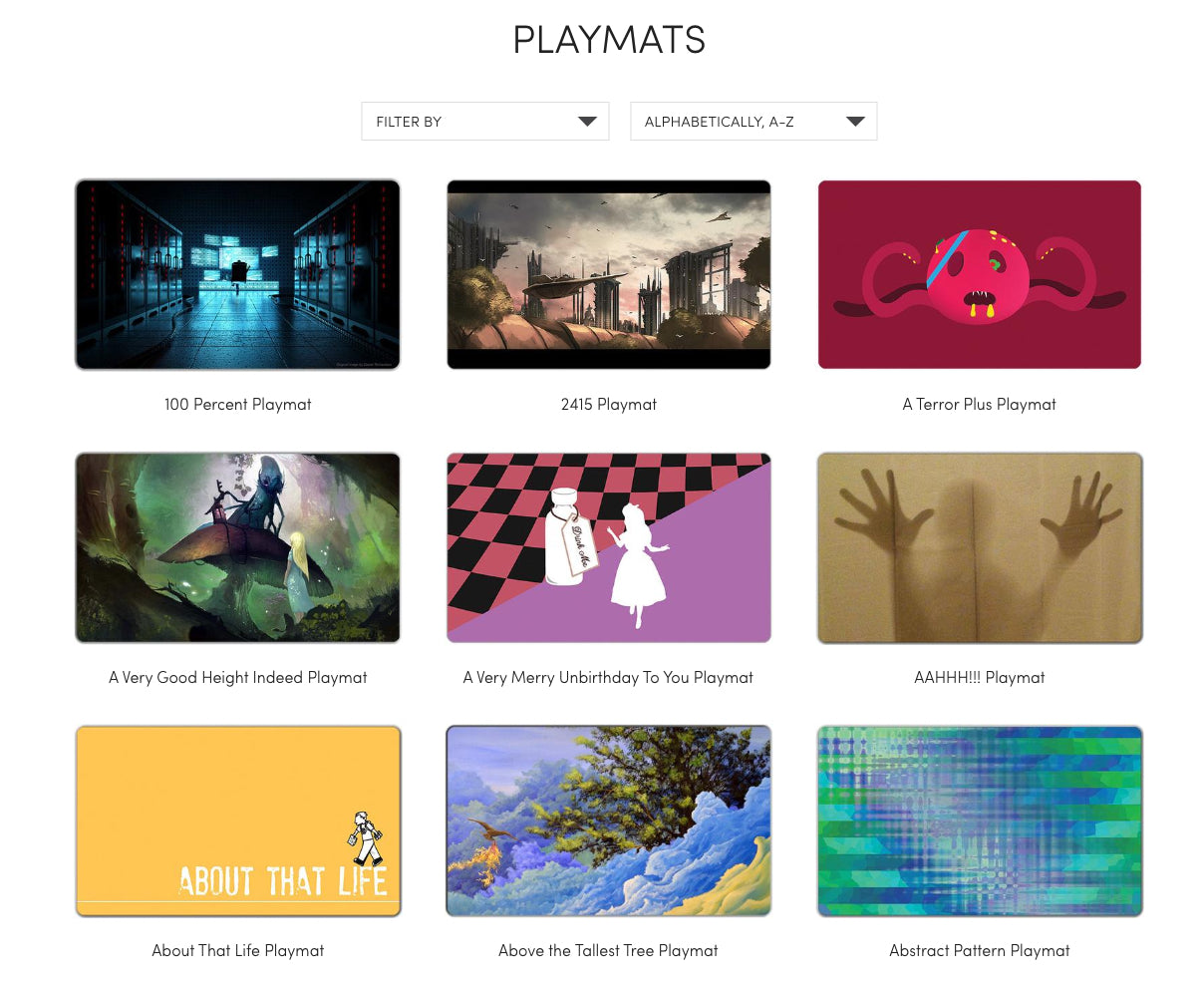
“He very successfully used Reddit and other platforms to spread the word, and built a crazy engaged audience of tabletop gamers who love these playmats,” McComas explained.
Despite growing a devoted group of customers, Pool’s big challenge lay in his website’s user experience.
McComas says because the product was so well-loved, and by a group of users who were often more technically inclined, most were willing to tolerate a sub-optimal experience in order to figure out how to order the custom product.
“That initial group of users were very tolerant of a pretty crummy user experience because they wanted it pretty bad.”
That initial group of users were very tolerant of a pretty crummy user experience because they wanted it pretty bad.
The way Inked Gaming works is that customers upload artwork, which has to be sized and cropped correctly. Most customers want to see what their custom order will look like before they hit the buy button, which wasn’t an option at the time. Additionally, customers typically need to upload high resolution art, something Shopify’s 25 MB file upload limitation wouldn’t allow, causing further problems.
All these issues meant support requests were through the roof, and averaged two support emails per order (yes, you read that right), wreaking havoc on Pool’s small team. And custom products meant shipping times could vary significantly, meaning more questions from eager customers.
“He was struggling to grow beyond that crowd and that’s when he engaged with us,” McComas said.
Fuel Made goes 1, 2, 3
Pool brought inShopify Expert Fuel Madewith the hope of hitting a number of goals:
- Improving conversion rates overall
- Improving mobile experience
- Addressing any technical limitations (customers upload high-resolution custom art to make products)
- Reducing customer service costs
- Addressing concerns customers have about shipping time
The first and largest challenge McComas and his team tackled was the upload process.
“We put a lot of careful thought and user research into coming up with a solution that would address all the key pain points of this process — and we nailed it.”(Tweet this)
Many of the support questions from customers revolved around how exactly the uploaded image would cut out, what size it would be, and how it would look.
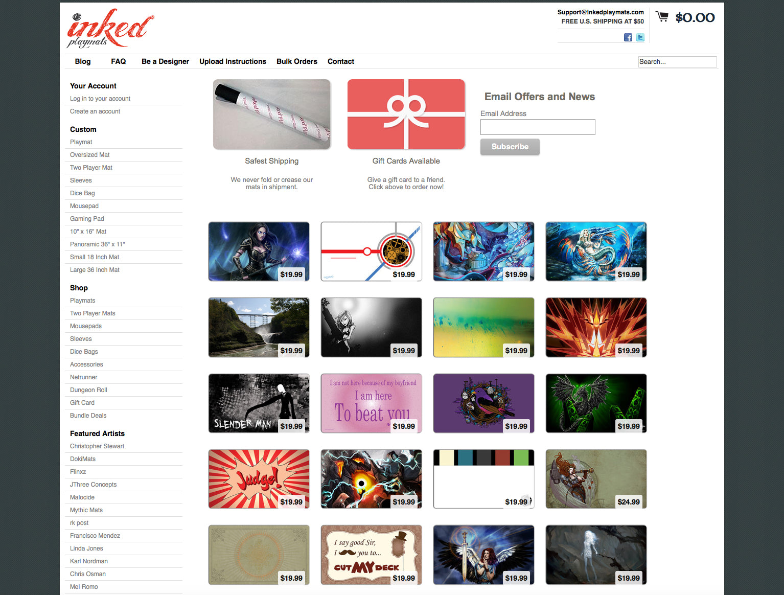
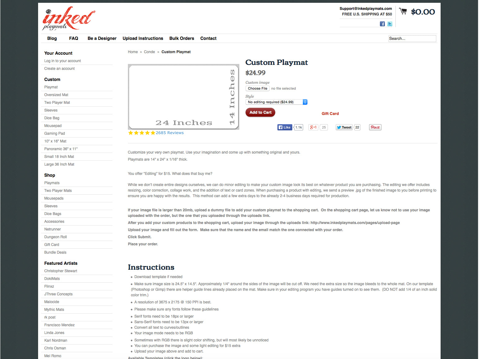 The original page where customers could place an order.
第一步是做研究;麦科马斯曾several conversations with Pool and his support team about the common user pain points. A self-described “user experience guy” for many years, McComas suspected that what he calls a “one, two, three process” would be a good place to start.
“It’s walking you through one step at a time. It’s a lot to deal with when you’re buying a custom product, and with every little ounce of complexity conversion goes down,” McComas said.
It’s a lot to deal with when you’re buying a custom product, and with every little ounce of complexity conversion goes down.
The team then created wireframes that outlined each step:
- Upload image from Dropbox, Google Drive, or your computer.
- Custom crop guides make sure the image is the right size and remove ambiguity around how the product will look, where it will be cut, etc. They even offer an upgrade for help with editing.
- Add to cart (which you can't do until you've completed the correct steps).
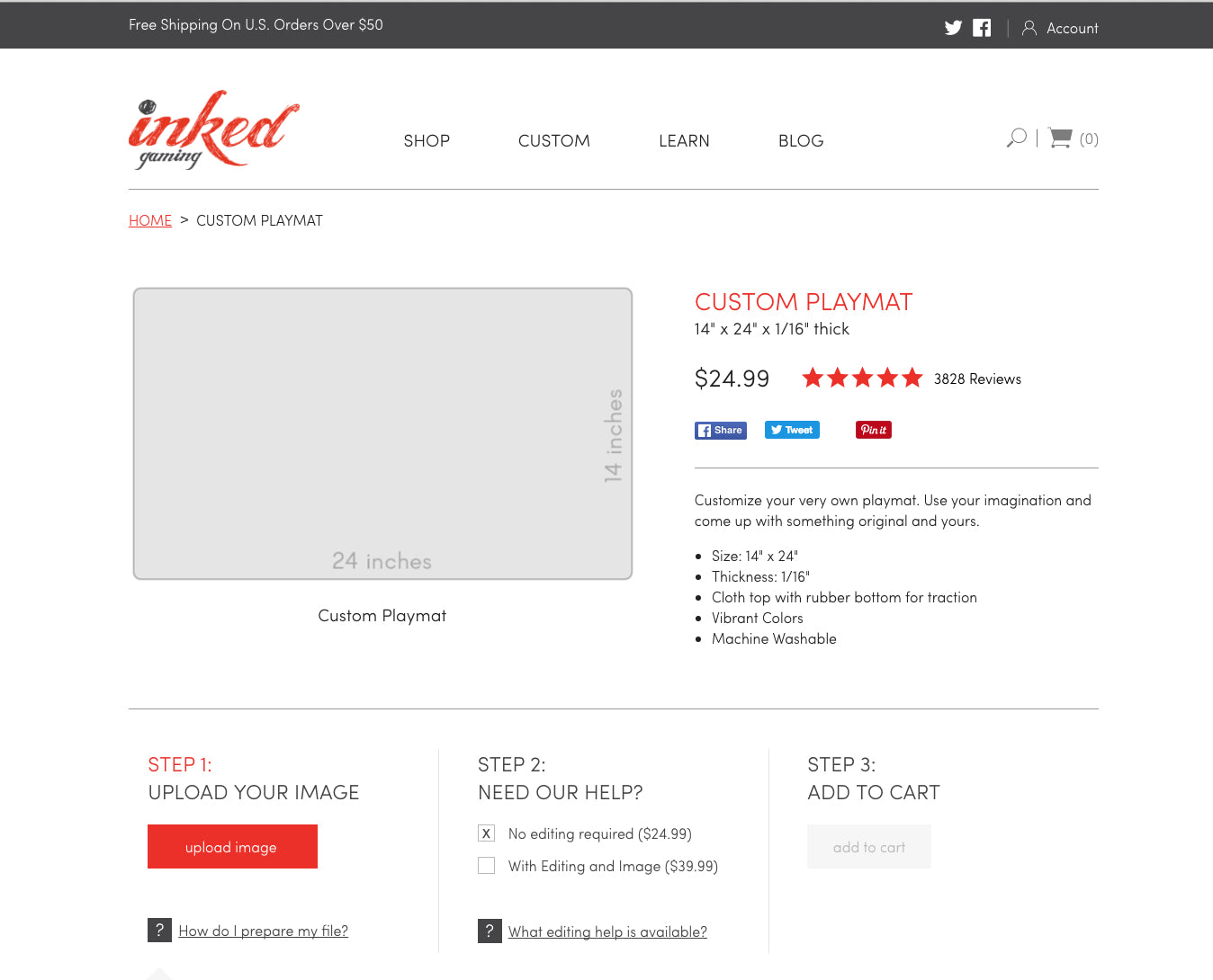 Today, customers place their custom orders here.
It’s a lot to deal with when you’re buying a custom product, and with every little ounce of complexity conversion goes down,”“We really tried to pull the complexity out of it, by breaking it into simple steps that customers they could follow, one, two, three through the process.”
You might also like:2 Guys. 6 Months. 7 Apps.
Tutorial time: Uploadcare
When it came to addressing the issue of uploading high resolution art, the Fuel Made team brought in a tool calledUploadcare, and decided some theme work needed to be done.
McComas even outlined his technical process in detail for the Web Design and Development Blog below:
这是一个快速教程如何create a simple Uploadcare integration with Shopify, so you can give your customers a way to easily upload large files with their order, during the checkout process. This can be used for several different use cases, such as custom print shops, audio/video files for transcribing, and more.
We’re using theMinimaltheme for simplicity, but the process shouldn’t be too different for any other theme.
- Create anUploadcare account, and an uploadcare project.
- Configure your widget usingthis page(don’t close it, we’ll need it in a minute).
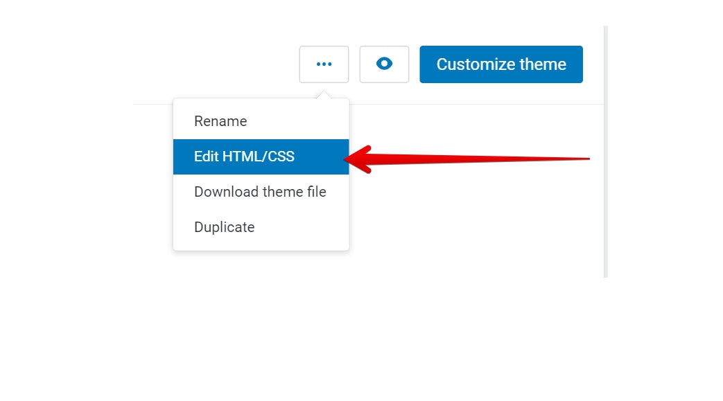
- In your Shopify admin, open theEdit HTML/CSSinterface for the theme where you’ll add the upload widget.
![Fuel Made: Tutorial 1]()
- Create two new snippets,name them
uploadcare-settingsanduploadcare-fields. - Copy the “script” part of the widget configuration from step two to the
uploadcare-settingssnippet.![Fuel Made: Tutorial 2]()
Example: - Add the following code to the
theme.liquidfile before closing the



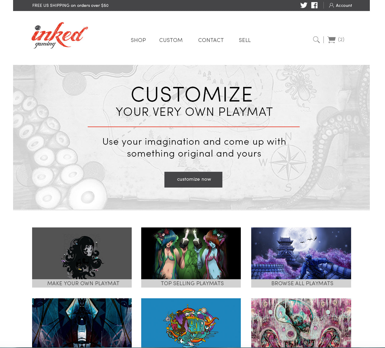 Inked Gaming’s homepage today.