

There are some logos so distinctive you immediately recognize them. Think of Nike’s swish or the Coca-Cola script. Just a simple brush stroke or a single letter can hold so much information about a brand—including the key to brand recognition.
And get this—75% of consumersname logos as the most identifiable brand recognition symbols.
So what makes a good logo? It depends on the core values of your brand, your audience, and the image you want to portray.
To help you out, here’s a breakdown of the types of logo you’ll see most often, with examples for inspiration.
Table of Contents
What is a logo?
A logo is a graphic representation of a company’s name, trademark, or other identifying information. It is often used on things like letterheads, business cards, product packaging, websites, online shops, and the front of company stores.
Logos can be simple or complex, but they should always be identifiable to your customers (or potential customers). Many companies have multiple versions of their logo to fit different needs. For example, a horizontal version for use on a website and a vertical version for use on stationery. Some logos are merely the company’s initials, while others incorporate symbols or images.
The best types of logo are those that are simple and memorable: Think of Amazon’s a-to-z arrow or McDonald’s golden arches. Both are instantly recognizable logos that have come to represent their respective brands—so much so that the companies often don’t need to include their name alongside the logo.
Six types of logos
- Emblems
- Logotypes
- Pictorial marks
- Lettermarks
- Mascot logos
- Combination logos
Top-ranked company logosare a mix of styles—Apple’s simple depiction of an apple, Nike’s swoosh, and Coca-Cola’s flamboyant script font are all very different, but each one of them falls into one of the six most common types of logo.
1. Emblems
Emblems are types of logos that closely resemble crests, the symbols most ofteh used in Europe to represent different (often powerful or rich) families. Emblem logos are more traditional in design and usually combine symbolic imagery as well as words, like the name of the company. They’re most often used by schools and universities (think: Harvard’s logo) but are also popular with auto companies and other groups that want to lend a sense of gravitas to their brand.
Emblem logos are often circular or crest-shaped and tend to feature classic color schemes—although you can easily mix old and new with a crested emblem logo in vibrant colors.
A well-known logo in this category is the one used by beer brand Stella Artois, which is red and gold, centers around the brand name and has a border that represents gold filigree on an oil painting. In fact, Stella Artois’s logo was created in 1366 and is thought to be the oldest logo still in use today.
When to use an emblem logo:Use emblem logos if you want to give a hat tip to age-old traditions, add a hint of historic whimsy to your brand, or communicate prestige and heritage.
Examples of emblem logos
Harvard University

Stella Artois

As one of the oldest logos in the world, Stella Artois’s emblem depicts history and tradition in one design.
Warner Brothers

The Warner Brothers’ logo combines the classic emblem shape with clean, modern lines and bold colors.
Harley-Davidson

The Harley-Davidson logo uses classic colors in a modern emblem shape to convey its decades-old history.
Porsche

Porsche’s logo indicates the car manufacturer’s prestige and matches the caliber of cars it makes.
2. Logotypes
A logotype is a text-based logo that uses the name of a company, usually in a unique typeface, to represent a company or product. They’re sometimes called “wordmarks” because the term “logotype” is derived from the Greek words “logos” and “typos,” which together mean “word mark.”
Logotypes can be created using a variety of typefaces, graphic elements, and colors. In order to be effective, a logotype must be simple and easy to remember. It should also be able to convey the essence of the company or brand it represents.
Overthree-quarters of Fortune 500 companiesuse sans serif fonts in their logos with only 2% using a handwritten or script font. The majority of brands use uppercase text in their logos, with just 7% of the world’s top firms (such as Mastercard and eBay) using lowercase logos.
When to use a logotype logo:Use a logotype design to build recognition around your brand or if your business has a memorable and catchy name.
Examples of logotype logos
Coca-Cola

Coca-Cola’s famous logo is an excellent example of a logotype. The company used its name to create an instantly recognizable graphic that is now known throughout the world.
Flings

Canon

Canon’s sturdy, timeless font highlights the reliability and professionalism of its products.
Amazon

Amazon is a prime example of a brand that uses a logotype font. The simple text is partnered with a playful arrow to create a memorable logo.
Flaus

Floss brand Flaus has created a logotype logo using a font that looks like teeth.
3. Pictorial marks
Pictorial marks are simple, clear graphics that represent a brand. Unlike logotypes—featuring the name of the company in a stylized font—pictorial marks are displayed without any accompanying text. This means they need to be immediately recognizable and distinctive enough to stand on their own.
Think of Apple’s apple logo, which is an instantly recognizable pictorial mark for the tech company. It’s simple and clear and can be used on anything from business cards to billboards to marketing materials without losing its impact.
Pictorial logos can be fun and creative, but it’s important that they still reflect the essence of your brand and give consumerssomeidea about your products or services. This can be tricky to pull off in a single image, but when done well it can boost recognition levels.
When to use a pictorial mark logo:Use a pictorial mark logo if your brand is already well-known or you have captured a specific segment of the market and can reflect that in a single image.
Examples of pictorial mark logos
Apple

Apple is the most famous pictorial logo. The bitten apple motif is instantly recognizable all over the world.
Beardbrand

剃须公司Beardbrand已经在它niche and created a simple pictorial logo that reflects the products it sells.
Beats

The Beats headphones logo not only includes the first letter of the brand name, but cleverly takes the form of a headphone too.
Target

Target’s red bullseye logo has become synonymous with the brand—most people will instantly recognize the pictorial logo without any prompting.
Chilly’s

Water bottle brand Chilly’s logo reflects the brand’s name. The gradient color palette adds interest to an otherwise simple design.
4. Lettermarks
A lettermark is a type of business logo that uses letters—usually the initials of a company or individual—to create a unique and memorable symbol. It’s sometimes known as a wordmark logo. Lettermarks are often used by businesses whose name is difficult to spell or pronounce, or when a company wants to create a more modern image. That’s because, unlike logotypes, lettermarks (or wordmark logos) usually use one or two letters and not the whole name.
Lettermarks adapt across marketing materials and different channels and help turn a business name into a memorable brand.
The luxury brand Louis Vuitton uses a lettermark—LV—on almost all of its products. Other luxury brands that use lettermarks as their logos include Diane Von Furstenberg and Chanel. Lettermarks are highly versatile and can be used in a variety of contexts, from print to digital media to direct placement on a product.
When to use a lettermark or wordmark logo:Use a lettermark or wordmark logo if your brand name is long or made up of two or more words.
Examples of lettermark and wordmark logos
MVMT

Watch brand MVMT’s solid logo mirrors the prolific, luxury designs of its products.
Louis Vuitton

HBO

IBM

IBM’s logo is bold and simple, with the lines running through it representing the speed and dynamic nature of the brand’s services.
Financial Times

TheFinancial Timeslettermark logo incorporates the first letters of each word simply laid on a brand-colored backdrop to add a bit of interest.
5. Mascot logos
Mascot logos are types of logos that feature a character or animal that represents a unique brand identity. This can be anything from a cartoon character to a real-life animal.
It’s important a mascot is easily recognizable and represents the values of the brand and the brand personality. For example, if a brand is trying to convey a message of fun and approachability, then a cute and cuddly mascot would be a good choice. On the other hand, if the brand is trying to convey strength and power, then a more intimidating mascot would be a better choice.
Ultimately, mascot logos should create an immediate association between the character and the brand, which can help to increase brand awareness and loyalty. The friendly, smiling creature made from tires and known as the Michelin Man is a versatile mascot seen not just at mechanic shops where the brand’s tires are sold, but also on the doors and windows of some of the world’s best restaurants, which are also reviewed by the company.
A logo effectively conveys a company’s personality—something that’s even more true of mascot logos. A well-designed logo that features a mascot of some kind can increase brand recognition and recall.TheJournal of Business Researchfound that brands with mascots had higher recall rates than those without.
When to use a mascot logo:Use mascot logos if your brand has a big personality or you want to humanize your business.
Examples of mascot logos
Michelin

The Michelin Man is a household name—so much so that the mascot is often more memorable than the brand itself.
Wendy’s

Wendy’s logo includes a mascot of “Wendy,” harking back to the brand’s beginnings as a humble diner.
KFC

Colonel Sanders is synonymous with one of the world’s most famous food brands.
Pringles

The Pringles mascot has evolved over the years but has remained an integral part of the brand’s logo. Today, he’s a simplified logo style featuring a recognizable mustache.
Monopoly

Monopoly’s mascot is a crucial part of the company’s branding—his hat is even a playing piece in the game.
6. Combination logos
A combination logo is a type of logo that combines elements of both text and imagery. The most common type of combination mark logos features a wordmark logo, or text-only logo, paired with a pictorial mark or symbol. This type of logo is often used by businesses that want to communicate both their name and their brand identity.
This makes it easier to adapt the logo for different materials, using the wordmark in some places and the icon where it’s most relevant.
When to use combination logos:Use combination mark logos if you want a more versatile option for your branding. They can also be good for new businesses that are building up their recognition levels.
Examples of combination logos
Adobe

Adobe’s abstract logo mark features a simple text depiction of the brand name alongside a more creative icon that represents the first letter of the brand name.
Wednesday’s Domaine
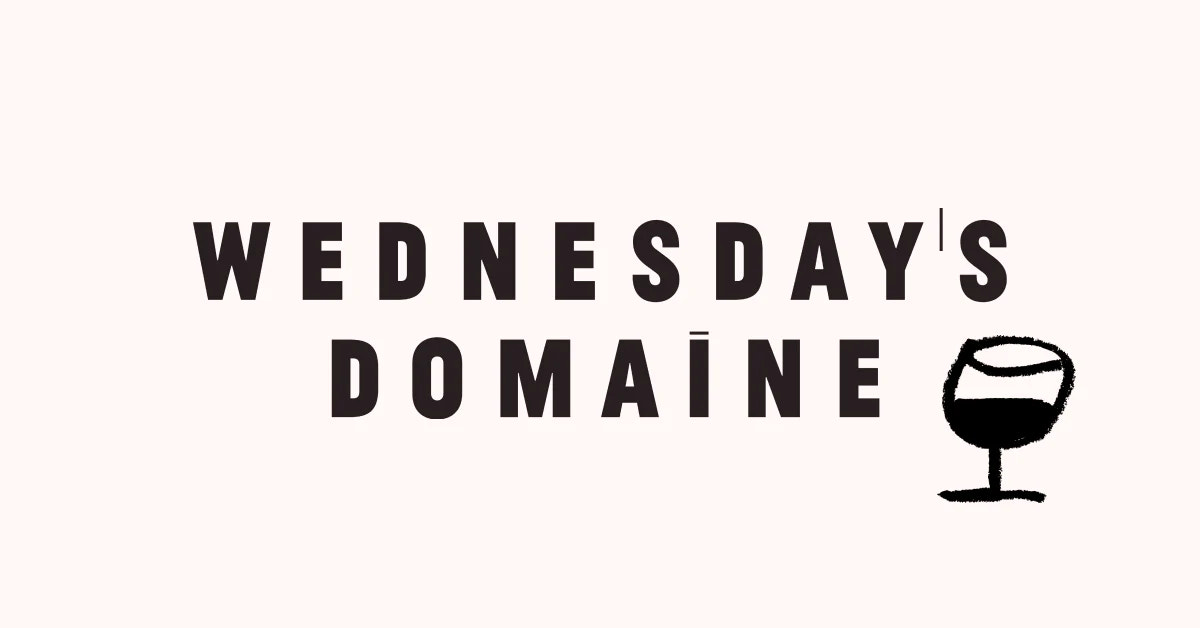
Wine brand Wednesday’s Domaine pairs a simple uppercase font with a hand-drawn image of a wine glass to add a playful touch to its logo.
Mastercard

Mastercard’s memorable logo symbol includes a lowercase text iteration of the brand name paired with two overlapping circles that symbolize the brand’s core values: unity, connection, and cooperation.
Delta Air Lines

Delta Air Lines uses a combination logo with an interpretation of the Greek letter delta (a triangle) pointing up, with the word “Delta” underneath (or beside). Not only is the pictorial portion of the logo indicative of the company’s name, but it also points up, representing what that company does (flies planes) and where it operates (above, in the skies).
百事可乐

百事可乐’s logo is simple but memorable. The lowercase text part of the logo is casual, while the logo symbol is thought to represent something a bit more complex: the earth’s magnetic field, feng shui, and geodynamics among other things.
Five tips for creating a good logo
- Figure out your brand
- Play with different types and do some research
- Pick your colors
- Choose the right typeface
- Shop it around
Logo creation doesn't have to be complicated or expensive. In fact, you can probably create a great logo on your own, without any design experience. Here are some tips for creating a good logo.
1. Figure out your brand
The most important part of logo design is determining what your brand stands for. Is it silly? Serious? Hip? Take some time with your team, if you have one, to answer some fundamental questions about your company.
Ask yourself:
- What drove you to start this company?
- What are your values?
- What makes you stand out from the competition?
- Who are your customers?
回答这些问题会让你在一个好的path toward figuring out your company’s logo.
2. Play with different logo types and do some research
Play around with different types of logos for your company and different versions of them.
Your logo might go through hundreds of iterations before you land on one that fits. Look at logos past and present—there are so many logos out there already—you don’t have to completely reinvent the wheel. You can draw inspiration from other company logos, both in your industry and outside of it, to help you get started. Do your best to not copy another company’s logo, though, as that is a form of copyright infringement.
3. Pick your colors
Drawing on both your previously determined brand identity and your research, it’s time to pick the colors that best represent your company and what you do. For example, many eco-conscious brands choose to use blues and greens in their logos, in order to represent the Earth. Similarly, a logo for a children's brand might use bright colors to attract a child’s eyes.
Usecolor psychologyconcepts to choose the right colors and convey the right message.
4. Choose the right typeface
Not all logos have words in them, but if yours does, then you’re going to need to choose a typeface. Pick something that’s easy to read, scales well, and can be reproduced in multiple formats (remember: this might be on a tiny bottle, a billboard, or a computer screen).
5. Shop it around
Show your logo to different people and get their reactions. Ask them open-ended questions like, “What does it bring to mind?” or “What does it make you think of?” You can also ask specific questions, such as, ”Do you like these colors?” or “Which parts do you hate?”
Try to get feedback from a variety of different people, not just your friends and family. If possible, you can arrange focus groups with those in your market demographic to get a clearer picture of how your logo resonates with the people who will likely be buying your product.
Five popular online logo makers
- Shopify’s free logo maker
- Canva
- LogoMaker
- Squarespace
- Wix Logo Maker
There are many online logo makers to choose from that will help you design a logo yourself with few design skills. Some arefree, while others charge a fee. SomeAI logo makerscan whip up a design in seconds, while others take more input.
1. Shopify’s free logo maker
Shopify’s free logo maker包括数以百计的标志模板和不再保险quire any design experience to get started. In addition to easy-to-create logos, it also offers social media assets and is available even if you don’t use Shopify as an ecommerce platform. The potential downside is that, because it works with templates, the customization is more limited than if you worked with a professional designer.
2. Canva
Canvais a user-friendly graphic design app that provides a bit more freedom to create and customize your logo. Its templates make it a good option if you have some design experience. Canva offers free plans and paid plans with more features starting at $12.99 per month.
3. LogoMaker
LogoMakeris another free logo design creator that uses logo templates to help you create a custom logo design. LogoMaker is not a free platform—a $40 payment is required to purchase your final results, which include multiple file formats so you can easily use your logo on a variety of items, like marketing materials or t-shirts, or online.
4. Squarespace
Squarespaceoffers a free logo maker that uses a vast database of icons to help you create custom logos for your company. The logos are easy to integrate with Squarespace sites, but customization is extremely limited, which makes it difficult to create unique and eye-catching logos.
5. Wix Logo Maker
TheWix Logo Makerstarts with a series of questions and then uses AI (artificial intelligence) to generate detailed logo designs based on your answers. It then lets you customize the options that it presents, using its database of icons. It’s a good option if you already have some idea of what you’re looking for in a logo and are prepared to customize it. However, it may not be the best choice if you’re looking for a logo generator.
Ready to create your business? Start your free trial of Shopify—no credit card required.
Logo design FAQ
Can I design a logo myself?
Yes, you can design a logo yourself. There are both free logo makers and paid logo generators online to help you create a unique logo.
What software can I use to create a logo?
Some of thebest logo makersinclude Shopify’s free logo maker, Wix Logo Maker, and Canva. You can also use professional design software like Adobe Creative Cloud, but it will cost more than online options.
What is the best place to make a logo for free?
Shopify offers a free logo maker that includes hundreds of templates and doesn’t require any design experience to get started.