Today’s customers expect businesses to be everywhere they are. Your brand needs to shine and leave a strong impression in every place customers—and would-be customers—come across it. And customers expect you to treat them the same regardless of where and how they’re interacting with your brand.
It’s easy to understate the importance of consistency inbrandingand marketing. Maintaining a dependable brand presence across all channels is critical to success. That’s where documented brand guidelines come into play.
What are brand guidelines?
Brand guidelinesare standards a business sets, such as colors, fonts, voice, and design, for the attributes of its public communication. Focusing on uniformity in your brand attributes and identity means everything customers see and hear from you evokes the same kind of feeling.
Your brand guidelines don’t have to be as complex and involved as those of massive global brands. After all, brand guidelines only yield a positive return on investment (ROI) if you spend time upholding them. That’s why smaller businesses can benefit from “minimum viable brand guidelines.” Even a brand style guide can be enough to get you started.
Learning how to write a pared-down style guide can ensure your marketing materials are consistent and on brand.
Why create guidelines for your brand?
Creating a marketing message that is unmistakably, undeniably your organization’s can ensure your message and image are synonymous with one another, regardless of who’s working on it.
- Keep everyone on the same page。随着业务的增长,你的团队也将如此。一组of standards ensures everyone is clear on how to represent the brand.
- Set your brand apart from your competitors。Distinct, strong branding helps you stand out in a crowded marketplace.
- Drive customer retention and loyalty。Your brand identity is what connects you with customers and your community. It’s what brings them back time and again.
What does a brand style guide look like?
Most businesses don’t have a full picture of what a style guide, or brand book, actually looks like, even if they’ve heard the term before. A brand style guide is a collection of rules forhow your public image looksand sounds. It acts as a compass for your brand elements, ensuring your business’s design, video, image, and text content all point due north—wherever that is for you.
If you aren’t sure what to include in your brand style guide, here are a few things to cover:
- Your logo: specifics of its design and usage, including acceptable sizes and colors
- Brand color schemes: their specific shades (including hex, CMYK, or RGB codes) and how and where they should be used
- Typefaces (or fonts): which ones can be used and where (i.e., headings and body text across your website, blog, and欧宝体育官网入口首页)
- Your ideal audience
- Voice and tone: how your brand “speaks” to its customers in written communication
- Social media guidelines: rules for how communicating with customers on social channels differs from other communications
These guidelines will break down into two main sections: visual style and written style.
Visual style
Your visual style dictates the look of your brand and marketing. A basic visual style guide includes rules foryour logo, typography (font style, appearance, and structure), and color palette.

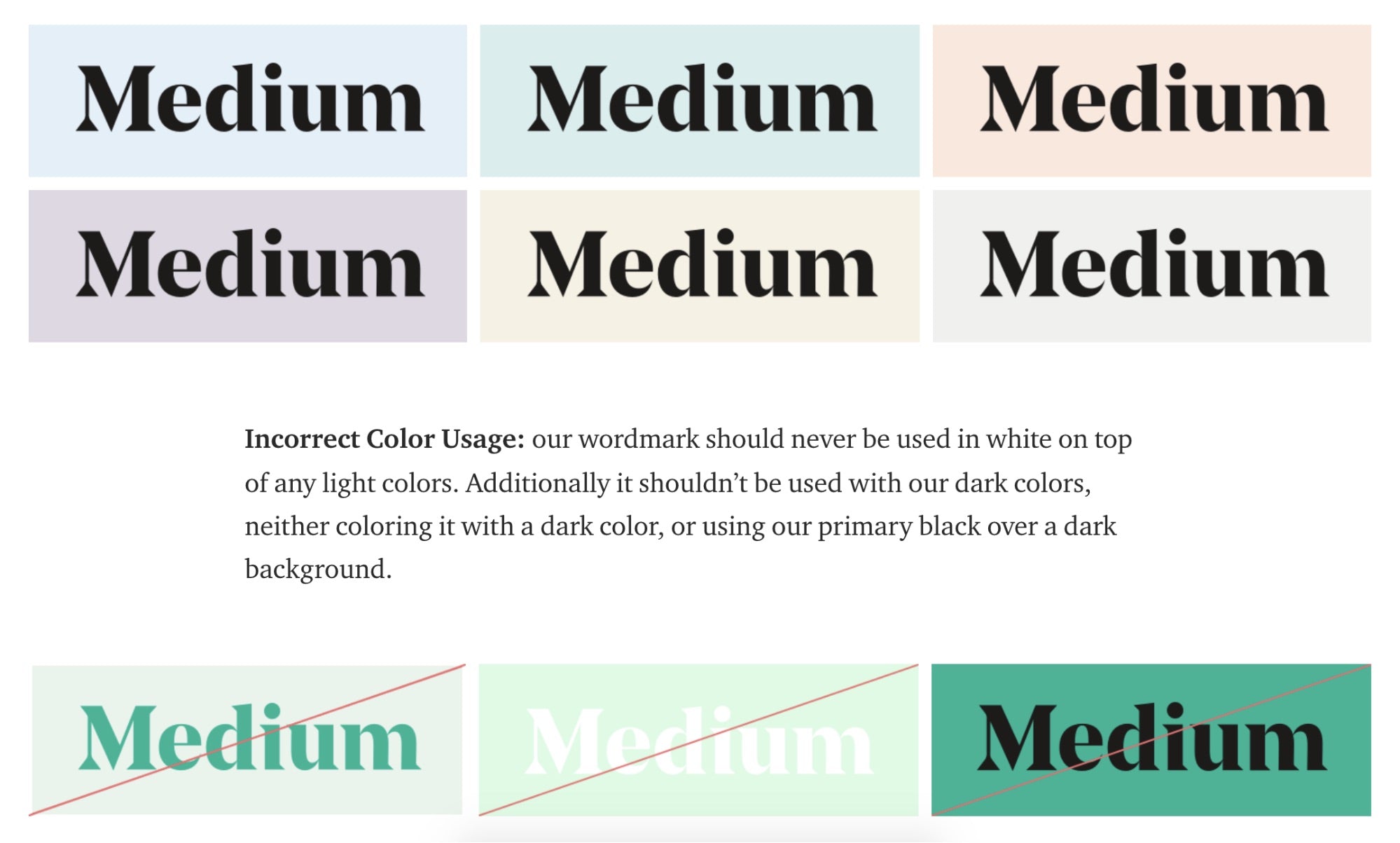
You may not need as many examples as Medium offers when you start, but consider how your logo should appear on both light and dark backgrounds, and define the colors you’ll use consistently. The idea is to put thought into how you want your brand to look (and how youdon’twant it to look).
Beyond your logo, define brand colors as well.Outdoor retailer REI does thiswith an extensive list of colors and its hex codes. Again, you don’t need to be as comprehensive, but you do want to make sure to cover all the colors, as well as provide context into how and where they should be used.

编写风格
One thing that can be tricky isdefining your brand’s tone of voice—specifically, parsing the difference between your brand’svoiceand itstone。Your voice is constant. Your brand should always sound like your brand, regardless of the channel or situation.

For example, Shopify’s brand voice attributes include:
- Confident, not arrogant
- Empathetic, not overprotective
- Transparent, not blunt
Those are the pieces that make up our brand voice or written style—and they don’t change. Tone, on the other hand, is how your voice adapts to different situations. For example, the tone you use with a customer who’s just made a sale is different from how you’d speak to a frustrated customer.
Your written style defines how your brand uses words to communicate. It includes things like voice, tone, and specific audience considerations. Who buys your products, what outcomes do they hope to achieve, and what voice will resonate with them? Remember the style choices you make are for your audience, not for you.

One of the most important things a written style guide does is explain how to find a balance between voice and tone. A well-defined voice can translate from tone to tone without losing its unique quality.
In the example above, note how Help Scout defines its voice as universally friendly, clear, and direct. That’s how Help Scout sounds across all mediums. Its tone, however, is made to adapt to and match individual situations. Those guidelines enable the Help Scout team to deploy a voice unique to its brand while still being considerate of the situation. As an example, being friendly and clear sounds different in a celebratory context than it does when speaking with a frustrated customer.
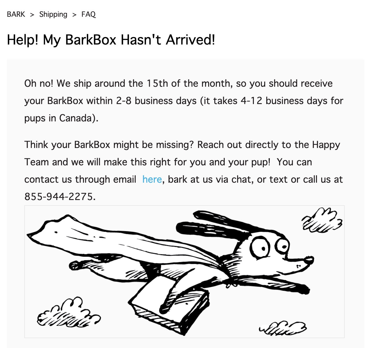
BarkBox is a great example of how your brand can sound like you, even when your tone changes. Take a look at how its voice translates from a social media post to a help article aimed at frustrated customers.
Me: you know that thing where you make eye contact with your dog, and their tail does the littlest happiest wag so then you HAVE to go and pet them?
— BarkBox (@barkbox)April 16, 2019
My boss: okay... but you were an HOUR late

The language sounds like it came from the same place—and is an extension of the same brand—but it’s been adapted to do two distinct jobs. Both are lighthearted, but notice how the tweet uses humor while the support article takes a more direct approach.
Seven top brand guideline examples to inspire yours
Branding and brand identity can be tough concepts to wrap your mind around in the abstract. That’s why learning from the example of other brands can be helpful. Several brands, both large and small, post their guidelines publicly, so you can take a look and see what an established brand’s style rules look like.
1.tentree
Rebrand tentreefromtentreeonVimeo。
Sustainable clothing brand tentree has a comprehensive style guide, complete with iconography, downloadable brand assets for logo usage, and more. The rulebook contains guidelines for all its visual elements, including fonts, colors, illustration style, product photography, and even animation and motion. It also dives into voice and tone, defining the brand’s key messaging with do’s and don’ts, establishing grammar guidelines, and offering a brand glossary.

2.Wolf Circus

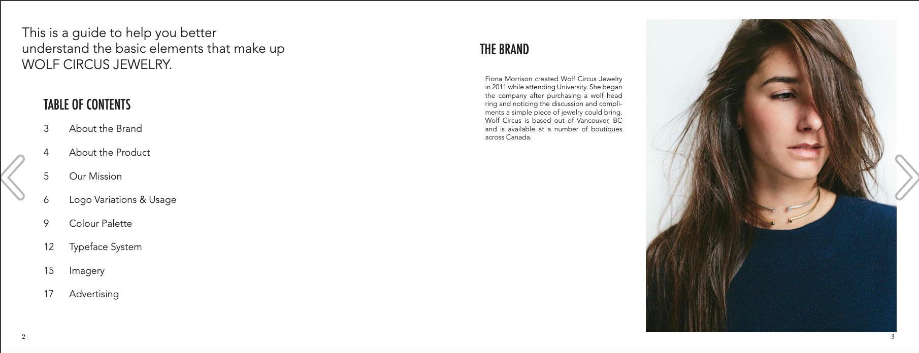
Wolf Circus, a women-ownedecommerce businessthat sells handmade jewelry, offers a great example of a simple style guide that covers the absolute essentials (you can bet it’s a good deal more concise than Pepsi’s style guide) and provides all the necessary information to enable new employees and collaborators to represent the brand accurately.

3.曼联By Blue

曼联By Blue certainly didn’t skimp on definingits brand identity guidelines—it has 56 pages of standards for design elements, the company logo,文案, and print design for things likebusiness cardsandproduct packaging。曼联By Blue does a particularly nice job at providing examples of proper usage and expression of brand elements.

4.High Horse Coffee

Nitro cold brewHigh Horse Coffee has a style guidethat defines the brand’s attributes, primary and secondary logos, color palette, photography guidelines, and typography. Overall, it’s succinct and to the point, so it’s easy to understand and follow. However, this style guide example is more focused on the visuals and doesn’t really define the tone or voice.

5.Fenty Beauty

While Rhianna may have a dynamic style and identity of her own, her brand, Fenty Beauty, is equally as distinct—andit has the brand guidelinesto prove it. The guidelines do a nice job of keeping the focus on the brand’s personality, while infusing a bit of Rhianna’s identity into it. But the focus remains on the brand’s visual identity and tone of voice, as well as guiding product packaging design.

6.Ben & Jerry’s

Ben & Jerry’s is a brand with a very distinct visual style—many recognize its flagship typeface, even when it isn’t on the side of an ice cream pint. For a brand like Ben & Jerry’s, investment has gone into creating a distinct brand feel. Its style guide is all about defining the brand story and ensuring the work put into it translates across all PR and marketing, down to the size of the font used in each heading.

7.WeWork

With more than 500 locations creating workplace experiences for businesses through their design and the physical layouts, WeWork had its work cut out for it when it came to building out a brand style guide. Fortunately, WeWork’s guidelines deliver by being clear, concise, and unafraid of addressing controversial points where its stance defines the brand.
If your business includes physical locations, the experience customers have there becomes part of your brand—and that should be part of your brand guidelines, too.

Three tips for creating brand guidelines that work
Not all brand guidelines are effective. If you don’t approach your style guide with a strategic and pragmatic mindset, you’ll likely come up with something obsolete. Follow these three tips to ensure your style guide does the job you intend it to do.

Free Reading List: How to Brand Your Business
A great brand can help your products stand out from the crowd. Get a crash course in small business branding with our free, curated list of high-impact articles.
Get our Branding reading list delivered right to your inbox.
Almost there: please enter your email below to gain instant access.
We'll also send you updates on new educational guides and success stories from the Shopify newsletter. We hate SPAM and promise to keep your email address safe.
1. Start with your mission statement
Creating consistency across different media and channels admittedly isn’t easy. The key is to connect each element of your brand’s style back to one central theme: your mission.
A distinct and opinionated business mission acts as a center of gravity that influences everything your business does. Which products to carry, your marketing messaging, your pricing strategy—all of these decisions should be made with your mission in mind. The same goes for your brand guidelines.
Think about what your visual style says about your brand. Is it in line with your mission? How about the voice you use to speak to customers? What does it say about your brand?
For example, if your mission is to build inclusivity by fulfilling the needs of underserved segments of the market, your brand guidelines should outline rules for pronoun usage. If your mission is to humanize and democratize a complicated, arcane industry, your brand voice may lean toward friendliness and approachability over formality.
2. Provide branded templates
As your business and team expands, brand guidelines become increasingly important. However, people can have different interpretations of those guidelines, especially since we’re discussing a concept that’s so subjective.
Branded templates for commonly used assets and projects can mitigate inconsistencies and misinterpretations. Branded templates also make it easier for folks who don’t know graphic design to come up with visual designs that meet brand standards.
You might consider creating branded templates for the following:
- Website banners
- Landing pages
- Emails
- Social media posts and ads
- Price and product tags
- Packaging inserts
3. Think about social media
It used to be that most brands could get away with one set of guidelines, but the rise of social media has complicated things.
Much of what’s considered normal or acceptable on social media doesn’t always align with other communication channels—you’ll need to define a much different tone to strike a balance between adapting to the norms of social media and maintaining your brand voice. That’s why your style guide should address things like whether or not your brand uses emojis or abbreviations and what kind of images it shares.
We recommend adding a separate section of your style guide to define how your brand presents itself on social media. It’s helpful to specify:
- Your specific social media tone and how it changes based on the platform and situation. Support conversations on Twitter may need a different tone than comment replies on Instagram.
- Whether you use emojis, abbreviations, and slang.
- Guidelines on hashtag usage.
- Image guidelines, such as whether the brand posts or shares memes.
- Content guidelines. Do you avoid posting about specific topics? Take a strong stance on others? What content formats do you skew toward (article links, original photos, customer generated content, gifs, etc.).
Brand guidelines keep your marketing consistent
If you’re wearing all the hats in your business right now, you might be able to go without brand guidelines for a time. But documenting the look and feel of your brand is one of the best ways to create consistency across all of your marketing, especially as you scale up and onboard more people.
As your team grows or your business attracts more attention, a simple brand style guide is the best way to communicate that look and feel to new people—so your brand never gets watered down.
Ready to create your first business? Start your free trial of Shopify—no credit card required.
Brand guidelines FAQ
What are brand guidelines?
Brand guidelines are the standards a business sets for the attributes of its public communication. This includes elements such as colors, fonts, voice, logo, and design.
Are brand guidelines the same as a style guide?
Brand guidelines are the same as a style guide. The terms are interchangeable. However, sometimes brand guidelines are more comprehensive.
Why should I create guidelines for my brand?
You should create guidelines for your brand to ensure consistency across all channels and touchpoints for every customer interaction. Brand consistency builds trust and ultimately drives sales.
What should I include in my brand guidelines?
- Logo
- Brand colors
- Typefaces and fonts
- Your ideal audience
- Voice and tone
- Social media guidelines


